|
|||
|
|||
|
|||
|
|||
|
|||
|
|||
|
|||
|
|||
|
|||
|
|||
|
|||
|
|||
|
|||
|
|||
|
|||
|
|||
|
|||
|
|||
|
|||
|
|||
|
|||
|
|||
|
|||
|
|||
|
|||
|
|||
|
- GBCN
- BNOTB
- Book Club
- Crafts
- Current Events and Politics
- Disney & Theme Parks
- Drinking While Parenting
- Entertainment
- Food & Entertaining
- Geeks & Gamers
- Getting Pregnant
- Got Pregnant
- Health and Fitness
- Home & Garden
- International Living
- Makeup
- Married Life
- Military Families
- MM Moms
- Moms of Multiples
- Money Matters
- Pets
- Recovery
- Special Needs
- Starting Over
- Style & Beauty
- Teachers & Educators
- The Olds
- Travel
- Trouble in Paradise
- Trouble TTC
- Water Cooler
- Well-being
- Whole30
- WOC
- Communities
- Help/FAQ
GBCN
Communities |
|


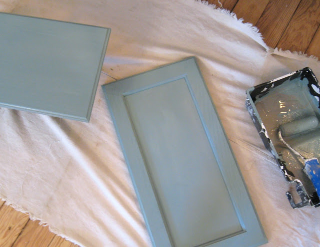
 for the bottom cabinets and
  for the top cabinets.
 on the walls


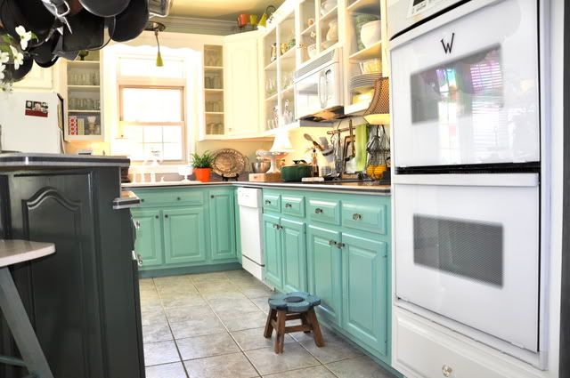


 Sherwin Williams Needlepoint Navy
 Sherwin Williams Majolica Green